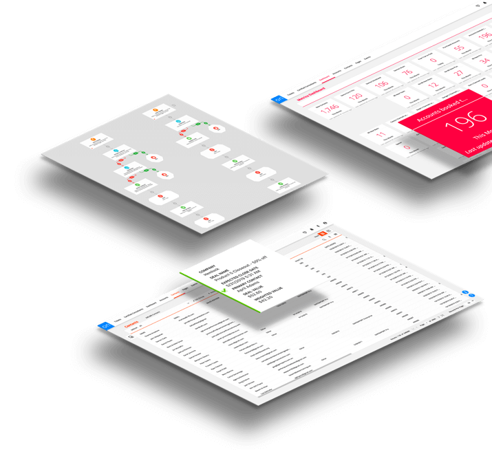
We’re proud to have a bold user interface that is truly worthy and reflective of the automation power that’s underneath it. Although the underlying functionality of Ontraport hasn’t changed, this newly designed skin will make it easier than ever for users to navigate between screens and work inside the platform — allowing them to accomplish more, faster. Here’s an overview of some of the most exciting changes you’ll see:
New Location and Lots of Improvements for the Main Navigation Bar

Previously, links to the Dashboard, Tasks, Contacts, Sales, Sites and Tracking were located in a silver bar on the left side, and you could expand to additional navigation options by floating your mouse over each category. In the new interface, we’ve moved the main navigation icons to remain fixed at the top of the screen, taking up less space and leaving more horizontal space available to view whatever you’re working on.
Bigger and Bolder Colors, Fonts and Layout
Larger fonts throughout the app, bolder colors and contrasts, and more definition and negative space between page elements are intended to improve users’ ability to find things and reduce overwhelm. Additionally, we’ve also moved About This Page and Ontraport Projects to the bottom right for easy access and reduced distraction.
Updates to Groups, Collections and Contact Records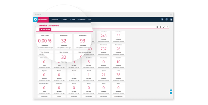
Inside the newly designed version of Ontraport, navigating and performing actions in the Groups collection is easier than ever. Before, the actions drawer pulled out from beneath the top menu (covering up the top few items in your collection); now it will simply replace the main navigation bar at the top of the screen with all available actions for your collection, taking up less space and making it easier to see all items in the group. We’ve also made the options to select “All in Group” vs. “All on Page” much clearer so that it will be easier for users to perform an action on the exact group intended.
Additionally, we’ve made it easier to navigate within individual contact records by moving the tabs to the left side, so you can easily switch between Notes, Tasks, Purchases, Membership Info and more. Performing an action on a contact while viewing a record is also simple, as the main navigation bar is replaced with a list of available actions that can be performed on that contact with just a few clicks.
Design Improvements to Rules and Sequences

The newly designed interface includes many welcome changes to the Rules and Sequences editors as well. For improved ease of use, Sequence steps are now color-coded so you can easily see the order in which your Emails, Tasks, SMS Messages, Fulfillment Lists and Rules are arranged. We’ve also moved Sequence statistics and subscriber information to the top right for easy access.
As an extra bonus to the Sequences update, it’s now possible to add Notes for each individual step in a Sequence (rather than one Notes box for the entire Sequence) so that you can quickly remember what each step is for and how it fits into the rest of your business.
Finally, the Rules editor is now much easier to read and navigate. All Rule Triggers, Conditions and Actions have been categorized into CRM, External Events, Messages, Sales, Social and Sites/Pages to make it easier to find the exact Rule components you’re searching for without scrolling through the entire list.
More Page Real Estate Available for All Ontraport Editors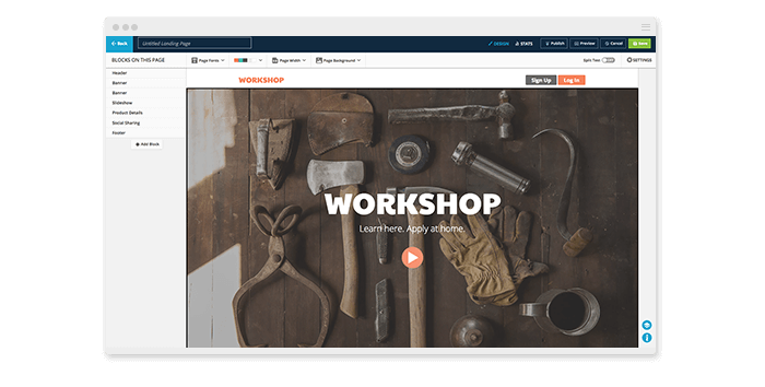
With the new location of the main navigation bar, more space is available to view and edit your landing pages, email messages, forms and postcards. All Ontraport Editors will now automatically open in full-screen mode, giving you a larger workspace. In addition, larger buttons and more defined design tools will streamline your workflow and make it even easier to create stunning marketing collateral for your business.
How to Upgrade
To make the update to the new interface as convenient as possible for Ontraport users, we’re leaving the option of when to upgrade completely open. Starting today, when you log in to your account, you’ll see an announcement banner at the bottom left of your screen. Simply click the link to upgrade to the new interface, and you’ll be set to go! If you decide you’re not quite ready to upgrade for good, you’ll also have the option to switch back — simply click the link at the bottom left to downgrade back to the old version of the interface.
Log in and check out your new interface today, and let us know what you think!