
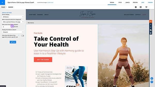
Elements are the text, images, videos, forms and other content that you drag-and-drop onto a page. Select your page elements from the palette on the left side of your canvas when you’re creating a page. With the flexibility of this visual page builder, every element can be customized to your liking.
Table of contents
Create a layout
Element settings
• The “Style” tab
• The “Position” tab
• Advanced settings
Text and Button elements
• Edit your text settings
• Add links to text
• Use font styles
Image and Video elements
Form and Sales elements
Customers elements
Dynamic content elements
Advanced elements
Create a layout for your page elements
One of the best ways to ensure that your pages look good is to create a layout grid for your page elements before adding them.
It’s an Ontraport best practice to create the block layout using columns and rows as opposed to relying on your elements’ position settings.
It’s possible to arrange page elements without creating a grid design, but that’s not ideal. Your page content will move around based on screen size. Creating a grid layout holds your elements in their relative positions so visitors viewing your page on different devices will see a consistent layout.
Element settings
/Page+Elements/elements-settings_style_position_tabs.png)
On the left side of your screen, click on any element to open its settings. The first tab you’ll see is Settings, but you’ll also have Style and Position tabs.
This article mainly focuses on how to customize the settings available in the Settings tab, but you’ll see similar options in all Style and Position tabs, regardless of which element you’re customizing. Check out the sections below to see what’s available from the Style tab and the Position tab.
The “Style” tab
/ontraport+pages+-+elements+-+button+-+style+tab.png)
The Style tab is only available on some elements, such as buttons or form fields. Style tab settings let you customize your element’s design.
Quickly select a style from your presets or favorites, or click Edit Style to access more granular styling options.
/Page+Elements/elements-style_tab_detailed.png)
The “Position” tab
/ontraport+pages+-+settings+-+position+tab.png)
Every element has its own Position tab with settings to customize the padding, margin alignment and sizing settings.
/Page+Elements/elements-position_tab_detailed.png)
Advanced settings
Back to topYou can customize these settings by hovering over your element and clicking and dragging the drag handles to move and/or resize your element.
/Page+Elements/elements-position-drag_handles_example.png)
Every element has an advanced settings section that allows you to add custom classes to the element’s wrapper to target the element with CSS or Javascript.
Note that when you customize text elements, you set properties on an outer wrapper element instead of the HTML element that directly holds the text.
So, if you want to change the color of text or add decoration such as italics or underlining, you need to target the inner element.
.my-custom-class .opt-text-wrapper { color: red; }
Or you can target each element inside of your custom class like this:
.my-custom-class * { color: red; }
Here’s how to use custom CSS classes:
- Click on the element you want to add a custom class to, then click the Position tab.
- Scroll down to advanced settings, and add a custom CSS class to the “Custom block classes (advanced)” field.
- Click Done to save your settings.
- Go to Settings → Custom Code → Header.
- Add the CSS you want to apply to your element.
- Click Done to save your settings.
/pages-custom_element_classes-example.gif)
Naming classes
CSS class naming conventions help you reduce the effort required to read and understand your code. Here are some general rules and best practices for naming CSS classes:
- Use meaningful names: Class names should reflect the purpose or function of the element they are applied to. Avoid generic names like "red" or "big," and opt for descriptive names like "primary-button" or "header-navigation."
- Use lowercase letters: Stick to lowercase letters when naming classes to ensure consistency and prevent confusion.
- Separate words with hyphens (-): Use hyphens to separate words within class names for readability. For example, use "header-navigation" instead of "headerNavigation" or "header_navigation."
- Use meaningful abbreviations sparingly: While abbreviations can keep class names shorter, you should prioritize readability and clarity over brevity. Only use abbreviations if they are widely understood and don't sacrifice clarity.
Using merge fields in classes
You can also use merge fields in your class names to customize your element’s style dynamically.
For example, if you want to use a color field to customize the color of your blog title’s font, you can add the merge field to your class, such as “blog-title-category-[Page//Block//Category Color].”
Then, in the header section of your custom code, you’ll create styling for each element by using a merge field on a dynamic block. For example, imagine you have three values in your Category Color field, red, orange, and yllow. In the custom header section, you’ll add an element that includes each value in your color field and specify the color you want to display.
/pages-merge_fields_custom_CSS_elements.gif)
Creating conditional elements
Another helpful way to use merge fields in your custom classes is to show or hide elements based on values saved in your record.
For example, if you have a checkbox in your blog post records that indicates whether your article is published or not, you can dynamically display either a “Read now” button when your article is published or a “Coming soon” button when it is not.
Add the merge field for your checkbox into your custom class: “learn-button-[Page//Block//Published]” for the “Learn more” button and “coming-button-[Page//Block//Published]” for your coming soon button.
Then, set the custom code to hide the learn more button when the class is “learn-button-No” or the coming soon button when the class is “coming-button-Yes.”
/pages-custom_class_show_hide.gif)
Text and Button elements
There are five elements that allow you to customize the content on your page:
The Headline, Sub Headline and Text elements allow you to add editable text to your page. You can edit your font’s style after you add the element to your page.
Use the Button element to add a link to your page. Drag a Divider element to break up the content on your page.
/ontraport+pages+-+elements+-+all+text+and+button+elements.png)
Headline element
/Page+Elements/elements-headline.png)
Use the Headline element to add headline font style text.
/Page+Elements/elements-headline-example.png)
Sub Headline element
/Page+Elements/elements-sub_headline.png)
Use this element to add text that uses the Sub Headline font style.
/Page+Elements/elements-sub_headline_example.png)
Text element
/Page+Elements/elements-text.png)
Use this element to add text that uses the body text font style.
/Page+Elements/elements-text_example.png)
Edit your text settings
Once you’ve added text to your page, click on it to customize your text settings. When you click on any Text element, you’ll see a text toolbar at the top of your screen with common text options.
/ontraport+pages+-menu+tools+-+text+styling+and+formatting+bar.png)
Add links to text
Creating a hyperlink in Ontraport is a lot like creating one anywhere else, and links can be added to any Text element.
Highlight the text you want to hyperlink, and click  from your font toolbar. Select your link type.
- URL: Add the web address of a specific page such as your business website.
- Ontraport Page: Link to one of your published Ontraport Pages.
- Link to a block on this page: This allows the visitor to jump to a block located somewhere else on the page.
- Tracked Link: Add a link that can trigger actions when your cookied contact clicks it.
- Ontraport Hosted File: Insert a PDF or other type of file you hosted in the Ontraport File Manager.
- Ontraport Form Lightbox: Show your contacts a pop-up when they click your link.
- Link to a URL field: Insert links stored in URL fields.
And customize what you want your links to look like from your Text element’s settings.
/Page+Elements/elements-text_settings.png)
Select protocol for URL links
More link protocol options appear when you create a clickable link, like a button or highlighted text. Here's how you can use each option.
| Protocol type | Description | Example link |
|---|---|---|
https:// (default) | Applies to web links secured by SSL/TLS certificates, commonly used for secure web addresses. | https://slurpeestoburpees.com. |
http:// | Applies to non-secured web links, typically used for PURLs in Ontraport. If directed to a secure page, the browser will redirect you. | http://3marketeers.com. |
mailto: | With an email address, create a clickable link. Click the link to open your device’s default email app. Write and send emails with a simple click. | mailto:info@pawsitivevibes.com.com. |
tel: | Create a unique link to call a specific phone number. Clicking the link prompts a call, often used by phone users, but also functional on computers with the proper program for handling these types of links. | tel:555-867-5309. |
sms: | With a phone number, create a clickable link that takes you to your device's default messaging app. Easily start a conversation with the specified number. | sms:555-867-5309. |
other | “Other” is not a protocol itself, but allows you to include any protocol included, but not limited to, the ones above. Any valid URL scheme can be included here. | Inserting javascript:history.go() will refresh the page when the link is clicked. |
Note: Links created using Other are not tracked. They won't show up in the contact log and you can't run automations based on these link clicks.
Use font styles
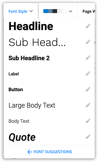
The font style dropdown from your text toolbar lets you choose which font style you want to apply to each Text element. This makes updating your fonts across your page easy. For example, if you update your Headline font style from Work Sans to Roboto, you’ll change the fonts on all of your headlines.
- Highlight your text and click Font Style the dropdown.
- Choose a font.
- (Optional) Edit your font style. Click
/ontraport+pages+-menu+tools+-+font+style+dropdown+-+pencil+icon.png) next to your font and choose the font family, size and weight.
next to your font and choose the font family, size and weight. - Click Save.
/font_style-edit_settings.png)
Button element
/Page+Elements/elements-button.png)
Use this element to add a button to your page. Buttons are commonly used for actions you want your visitors to take, such as “Log in” or “Join now.”
Button elements allow you to customize the text and add a link to your button.
/Page+Elements/elements-button_settings.png)
Divider element
/Page+Elements/elements-divider.png)
Use the Divider element to add a divider to your page. Choose what type of divider you want to use from the settings:
- Plain
- Text
- Icon
/Page+Elements/elements-divider_settings.png)
Image and Video elements
You can add four elements to your page to add visual interest:
Image element
/ontraport+pages+-+elements+-+image.png)
The Image element allows you to add and edit images on your page. From your Image element settings, choose the default image you want to display. If you’d like your image to change when visitors hover over it, click Hover and select an image.
/Page+Elements/elements-image_settings.png)
Icon element
/ontraport+pages+-+elements+-+icon.png)
Drag an Icon element to your page to add a Google or Font Awesome icon to your page. Add a URL in the “Icon link” field to make your icons clickable links.
/Page+Elements/elements-icon_settings.png)
Video element
/ontraport+pages+-+elements+-+video.png)
Use this element to add a video to your page. From the Video element settings, select what kind of video you want to add. Choose from:
- Ontraport
- Select one of your Ontraport hosted videos. Learn more about Ontraport video hosting in this lesson.
- YouTube
- Vimeo
- Wistia
- Embed
/Page+Elements/elements-video_settings.png)
Note that autoplay can only be enabled for videos without sound. This is a browser limitation.
Slideshow element
/ontraport+pages+-+elements+-+slideshow.png)
Use this element to add slideshows to your pages. When you first click into your slideshow settings, you can choose how many slides you want to appear on your page. Click on each slide to customize it.
/Page+Elements/elements-slideshow_settings_1.png)
Each slide includes:
- Background
- Title
- Text
- Button 1
- Button 2
Click on the name of the particular slide to edit its content and settings.
/Page+Elements/elements-slideshow_settings_2.png) →
→ /Page+Elements/elements-slideshow_settings_3.png)
To remove any part of your slideshow, toggle it off.
/Page+Elements/elements-slideshow_settings_4.png)
Form and Sales Elements
There are ten elements that help you create any type of form:
- Form Field
- Submit Button
- Billing Address
- Shipping Address
- Credit Card
- PayPal Button
- Order Summary
- Order Bump
- Upsell Button
- reCAPTCHA
/ontraport+pages+-+elements+-+all+form+and+sales+elements.png)
Check out this article and view this lesson to learn more about using these elements to create forms on pages.
Form Field element
/Page+Elements/elements-form_field.png)
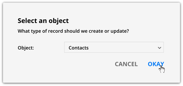
Use this element to add fields to a form. To add a form field to your page, select the type of record that should be updated. For example, if you’re creating a lead capture form, select “Contacts.”
Then select a field to add.
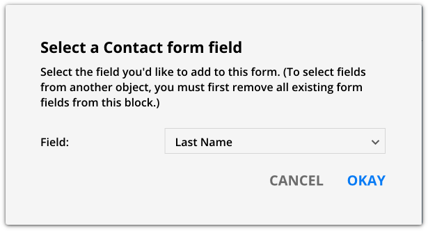
From the settings, customize your field’s label, placeholder text and prefill your field’s value.
/Page+Elements/elements-form_field_settings.png)
If you make your field required, you can write your own validation message to visitors who don’t fill out that field.
/Page+Elements/elements-form_field-validation_message_example.png)
Pro tip: When you add your first field, go to your Style tab and customize how you want your form field to look. When you add the rest of the fields to your form, the same style will be used.
Submit Button element
/ontraport+pages+-+elements+-+submit+button.png)
Use this element to complete your forms. Every form needs a Submit Button, and you won’t be able to publish your page if you have Form Field elements without a Submit Button in the same block.
/Page+Elements/elements-submit_button_settings.png)
Billing Address element
/pages-elements-billing_address.png)
Use this element to add all of the required billing address fields, which include:
- Billing address
- Billing address 2
- Billing city
- Billing state
- Billing country
- Billing zip code
When you drag the Billing Address element over, you will see all these elements appear on your page. You can rearrange them and customize their appearance after adding them.
When a customer enters information in these fields, it is sent to your payment gateway for credit card verification.
/Page+Elements/elements-billing_address_settings_1.png)
Note, dropdown fields allow you to edit your field’s dropdown values from the advanced settings. Edit, reorder and rename your dropdown values to put the most relevant billing address options at the top of your list. You can also pick a default value.
/Page+Elements/elements-billing_address_settings_2.png)
Shipping Address element
/pages-elements-shipping_address.png)
Use this element to add all of the required shipping address fields to your form at once. The Shipping Address element adds the following fields:
- Shipping address
- Shipping address 2
- Shipping city
- Shipping state
- Shipping country
- Shipping zip code.
If you’re selling physical products, make sure to add these fields.
/Page+Elements/elements-shipping_address_settings_1.png)
Note, dropdown fields allow you to edit your field’s dropdown values from the advanced settings. Edit, reorder and rename your dropdown values to put the most relevant shipping address options at the top of your list. You can also pick a default value.
/Page+Elements/elements-shipping_address_settings_2.png)
Credit Card element
/pages-elements-credit_card.png)
Use this element to add a set of fields that contain the minimum required information for most payment gateways:
- Name on card
- Card number
- Expiration month
- Expiration year
- CVC
/Page+Elements/elements-credit_card_example.png)
PayPal Button element
/pages-elements-paypal_button.png)
Use this element to add a “Pay with PayPal” button to your form which lets you use the PayPal standard payment gateway on an order form.
Customize the design of your PayPal button from the element’s settings.
/Page+Elements/elements-paypal_button_settings.png)
Order Summary element
/pages-elements-order_summary.png)
Use this element to add an order summary to your order form. This will tell your customers what they are purchasing and how much it will be. This element is required to allow your customers to use coupon codes on your order form.
From the Order Summary settings, you can choose what information you’d like to display on your order summary.
/Page+Elements/elements-order_summary_settings_1.png)
Translate your order summary element text to another language using the “Language” dropdown field.
/Page+Elements/elements-order_summary_settings_4.png)
If you’ve added a trial period to a product on your order form, the “trial label” field allows you to customize what you want to display on your order summary. For example, if you’re offering a discounted price as a promotion, you can change your “trail” label to “Spring blowout promo.”
/Page+Elements/elements-order_summary_settings_3.png)
Order Bump element
/pages-elements-order_bump.png)
Use this element to add an order bump to an order form to increase your sales. Check out this video to learn more about order bumps.
From the settings you can customize your order bump offer’s content.
/Page+Elements/elements-order_bump_settings.png)
Upsell element
/pages-elements-upsell_buttons.png)
Use this element to add an upsell form to your page. Note, Upsell elements cannot be placed on the same page as your main order form. Check out this video or this article, to learn about upsell forms.
Customize the text on your upsell buttons from the Settings tab.
/Page+Elements/elements-upsell_settings.png)
reCAPTCHA element
/pages-elements-recaptcha.png)
Use this element to decrease spam form submissions. When a visitor fills out your form, they’ll need to confirm that they are a person by clicking a checkbox .
If this is your first time using reCAPTCHA, follow the instructions in your element’s settings to generate a site key.
/Page+Elements/elements-recaptcha_settings.png) →
→ /Page+Elements/elements-recaptcha_settings_2.png)
Customers elements
There are three elements that allow you to add a Customer Center to an Ontraport Membership site.
/ontraport_pages-elements-all_customer_elements.png)
A Customer Center gives your members a location to log in and view their purchase and payment history, update their credit card details and change their login information.
Requirements
To use these elements, your page needs to be published to your membership site’s domain. And your page’s display settings must be set to “all logged in members.”
Update Credit Card button element
/pages-elements-update_cc_button.png)
Add this element to allow your members to update their own credit card information from an automatically generated update credit card page.
From the settings, you can customize your button’s text and if you want to use the updated card to process transactions in collections and/or update all open orders with that card.
/Page+Elements/elements-update_cc_settings.png)
Change Password button element
/pages-elements-change_pw-button.png)
Add this element to allow your customers to reset their password to your membership site from an automatically generated reset password page.
Customize your button’s design from the Settings tab.
/Page+Elements/elements-change_pw_settings.png)
Payment Info element
/pages-elements-payment_info.png)
Add this element to allow your customers to view their unpaid invoices, subscriptions and payment plans, and payment history.
Choose which sections to display, and customize your section headers from the Settings tab.
/Page+Elements/elements-payment_info_settings.png)
Dynamic content elements
There are two dynamic content elements that allow your visitors and members to interact with your content.
/ontraport_pages-elements-all_dynamic_content_elements.png)
Search element
/pages-elements-search.png)
The search element allows you to add search functionality to your site.
Learn more about setting up the search element here.
Reactions element
/Reactions-button.png)
Learn more about setting up the Reactions element here.
Advanced elements
Back to top of section
Back to top
There are five elements that allow you to add advanced functionality to your page.
/ontraport+pages+-+elements+-+all+advanced+elements.png)
Navigation element
/pages-advanced_elements-navigation.png)
Use this element to create a customizable, and fully mobile responsive, navigation menu for your sites.
Add and reorder the links you want to display on your navigation bar from the Settings tab.
/pages-navigation_elements_settings-example_1.png)
When you click on any of your navigation links, the settings allow you to name it, add a link URL and customize your design.
/pages-navigation_elements_settings-example_2.png)
Your links also include their own special settings to customize exactly how your navigation menu will function.
The custom HTML section in your settings allows you to add additional styling to your sidebar navigation menu so any design is possible.
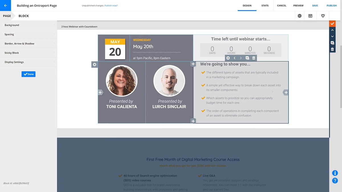
Countdown Timer element
/Page+Elements/elements-countdown_timer.png)
Use this element to add a countdown timer to your page. This is useful for drawing visitors’ attention to promotions or upcoming events.
From the Countdown Timer element settings, add the date and time to countdown to, where to redirect visitors after your countdown expires, and the language used on the countdown.
/Page+Elements/elements-countdown_timer_settings.png)
Social Sharing element
/Page+Elements/elements-social_sharing.png)
Use this element to add icons of popular social networking sites, and add links to them. This is a great way to get your site visitors to engage with you on other platforms.
From the settings, add logos and links to your favorite social media platforms. Choose from:
- Bēhance
- Tumblr
- Skype
- ShareThis
- RSS
- YouTube
- SoundCloud
- Vimeo
- Flickr
- Blogger
- Dribble
- WordPress
- DeviantArt
/Page+Elements/elements-social_sharing_settings_1.png) →
→ /Page+Elements/elements-social_sharing_settings_2.png)
By default, this element includes Facebook, Twitter and LinkedIn Icons. Click Add to add more to your list, or click an existing icon to edit it.
To create “share this page” links, follow these steps:- Visit Share Link Generator.
- Add the URL of the page you want your readers to share (i.e, your Facebook page, Twitter feed, etc).
- Click Create the Link.
- Copy the URL only, and paste it into the corresponding icon URL field in Ontraport.
Facebook Comments element
/Page+Elements/elements-FB_comments.png)
This element allows your customers to comment on your pages using their Facebook credentials. To use it, you’ll first need to create a Facebook App and obtain the App ID. Because this is a complex process, you may want to enlist the help of an Ontraport Certified Consultant to complete this step.
Create your Facebook App
- Create a Facebook for Developers account.
- Click Create App and name your application.
- Click Settings → Basic and add the required information.
- Click Save Changes.
- Toggle your app from “In development” to “Live.”
- Copy your App ID.
Add Facebook comments to your Ontraport page
- Open a new or existing landing page and drag and drop the Facebook Comments element onto the canvas.
- Click your Facebook Comment element to open its settings.
- Add the App ID you copied from Facebook into the App ID field.
- (optional) If you want your Comment element to show posts made on another page, add that page’s URL to the “comment URL” section. This is a great option if you’d like to continue a conversation that was started on another page.
- Click Done.
/Page+Elements/elements-FB_comments_settings.png)
Add Facebook’s moderation tool
Facebook provides a tool that allows you to moderate and manage the comments posted on your pages.
- Go to Facebook’s moderation setup instructions and copy the meta tag provided under “Setup using a Facebook App (Preferred).”
- Log in to your Ontraport account and go to the page editor of the page that you put the comment block on.
- Click Settings → Custom Code.
- In the header section, paste the meta tag and replace {YOUR_APP_ID} with your Facebook comments App ID.
- Click Done.
- Click Publish → Save & Publish.
Note, once you’ve saved your page, it may take up to an hour for Facebook to add the moderation tool to your comment block.
Add moderators
- Go to Facebook’s Developer Tools page.
- Click Comments Moderation Tool → Settings → Moderators.
- Add your moderators and click save.
Custom HTML element
/pages-elements-custom_HTML.png)
The Custom HTML element allows you to add raw HTML, CSS or JavaScript code into your page, further expanding the page’s capabilities. This could be used to insert your appointment calendar, connect to your custom-coded external application, or for a variety of other use cases.
This element is intended for advanced users and coders only. Please note that Ontraport cannot support or troubleshoot custom code, and that coding errors you introduce within the Custom HTML element can cause problems with no recovery possible.
/Page+Elements/elements-custom_HTML_settings_1.png)
From the settings, click Edit Code to add your HTML, CSS or JavaScript to your page.
/Page+Elements/elements-custom_HTML_settings_2.png)

/ontraport+pages+-menu+tools+-+font+style+dropdown+-+heart(favorite)+icon.png) . This allows you to easily access and use it again.
. This allows you to easily access and use it again.