Yet, despite the increasing traffic online, 74% of small businesses still don’t have an ecommerce site. Of the businesses that do, very few have a streamlined checkout process and order pages that steadily convert.
If you are ready to take the leap and make ecommerce a part of your business strategy, there are several best practices you’ll want to consider before you get started. We’ve compiled a list of five proven strategies that successful small businesses and entrepreneurs utilize to optimize sales processes online so you can successfully begin converting more leads into customers.
1. Offer a guarantee
One of the easiest ways to mitigate your customers’ biggest fears about buying your product is to address them with a guarantee right on your sales and order pages.
The goal is to promise your customers something that will take away their excuse not to buy right at that moment. Quell their fears by promising to make it right should you fail to deliver on your promise. For example: “If you don’t absolutely love our product, we’ll give you a full refund – 100% money back guaranteed.” Trust is essential in this exchange; ensuring it in your order pages will go a long way.
2. Provide reviews
Customer product reviews are some of the most impactful elements you can include on an ecommerce product page. Not only do reviews show that your product is legit and that customers find value in your product, but they act as powerful social validators that have a direct impact on the amount of sales you make.
In fact, 85% of consumers trust online reviews as much as personal recommendations. Reviews have become an integral part of an online shopper’s experience, so much that it might come across as sketchy if your website doesn’t include any.
The North Face provides a great example of incorporating customer reviews on their product pages. They provide the ratings in two places — right underneath the product in the form of a star rating and then more in depth reviews as customers visit the individual product page.
3. Include social proof
Similar to product reviews, social proof is both highly effective and necessary. Social proof is another way to build your online reputation and convince your customers to purchase. It can take multiple forms, including:
- Media logos: Recognizable media outlets that have featured your product
- Trust seals and certifications: Security certifications and authorizations
- Testimonials: Positive remarks from people who have already purchased your product
- Social sharing: Icons that make it easy for customers to share your product and see who has shared it in the past
- Privacy policy and terms and conditions: Create credibility for your site
- Influencer reviews: A quote from or link to video reviewers and journalists who have given your product a run through

Pro tip: Generate your own privacy policy for free here.
4. Be mobile responsive
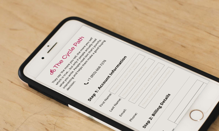
Being mobile-responsive is essential. Mobile purchases account for over 40% of ecommerce transactions in 2019, and by 2021, mobile purchases are expected to comprise 54% of all U.S. retail ecommerce. While you might design your ecommerce website with a desktop or laptop in mind, it’s important to optimize it for mobile as well.
An alarming 84% of users have experienced difficulties completing a mobile transaction, so streamlining your mobile experience is an important way to win over customers. Most web page builders, such as Ontraport Pages, make it easy by automatically generating fully responsive mobile pages.
An easy way to test your web page’s mobile responsiveness is to simply toggle on the mobile view on the top right corner of the screen inside of Ontraport Pages.
5. Have a streamlined checkout process
With the litany of web pages and products that are on the internet, consumers have the option to be extraordinarily picky. If your business has a confusing or cluttered checkout process, your customers can easily move on to a different page or even a different business.
Simplify the order process as much as possible: Reduce the number of steps customers need to take; minimize the questions or information you’re asking of your visitors, and test your order pages thoroughly before you push them live.
Use these guidelines to ensure your user checkout experience is intuitive and easy:
- Use as few form fields as possible: The more you ask of your leads, the more you risk them not converting into customers. Stick to the required form fields such as name, email, credit card and shipping address. Include only what you need to get your product to your customers.
- Keep it free of clutter: Make sure your order page is void of outbound links or unnecessary copy that will distract them from completing their purchases.
- Provide clarity: Consider the questions your customers will potentially have during check out, and answer them.
- Offer great customer service: Provide the phone number or email for your customers to contact you if they have questions.
- Avoid surprises: Make sure you’ve communicated clearly throughout the sales process and that your promises are confirmed on the order page to avoid last-minute cart abandonment.
