The design of your email templates may not be the highest priority on your list — you’re juggling a million pieces in your business — but email is one of the most effective ways to reach your leads and customers; it’s an opportunity to make a personal connection and put forward the best representation of your brand.

Does the design really matter? Yes, yes it does. How often have you received an email that was just plain ugly or boring? What did you do with that email? Read it? Trash it? More often than not, you’d delete it immediately without giving it a second thought.
Most people prefer to read an email that is well-designed because it sparks interest and gives the sense that your business cares about what it’s putting out there. The way your email appears visually plays a critical role in whether or not your audience will scroll, click, engage, or delete. Attention spans are short, and you only have a few seconds to impact someone — you might as well make it count. Here’s how to get started.
Email design best practice #1: Layout
Generally the shorter your email is, the higher the likelihood it will succeed. The way your email is laid out should make it immediately clear which content is important.
Here are some layout factors to keep in mind:
- Company logo: Put this up top so readers recognize who the email is from.
- Header text: This is often at the top and in a bigger font size than the rest of the email, in the hopes of grabbing attention immediately and enticing the reader to continue scrolling.
- Imagery: Use an eye-catching photo or illustration related to the copy to intrigue the reader. Emails that are lackluster and text-heavy don’t usually get the job done.
- Call to action: This is typically displayed with buttons or links with phrases such as, “Read More,” “Watch Now,” or “Learn More.” Make sure this stands out, as this is the goal of your email.
- Social sharing buttons: If you include buttons to your Twitter, Facebook, Instagram and other social media pages, be sure to keep them at the bottom of your email so they don’t detract from your main call to action.
Remember, readers are most likely on-the-go, skimming the email for relevant points to see if anything peaks their interest. Make sure your layout stops them in their tracks.

Email design best practice #2: Consistency
Consistency is key. Sending out emails that are all over the place design-wise won’t help you establish a recognizable brand style. Use your logo as the basis for your design concept and go from there. If you already have an established website for your business, create a template that matches to keep with brand consistency. This will further exemplify professionalism, leading to trust and a comfort level established between you and your audience.
Don’t be afraid to test different designs to figure out which one best suits your clients. Once you’ve found something that works, you can use the same template again and again, or tweak it slightly when necessary.
Email design best practice #3: Design
When it comes to email design, it’s important to keep in mind that people are attracted to things that feel real and not forced so, whenever possible, show off your brand’s personality and culture through the design of your emails. Your readers will respond positively to an email that has charisma, as opposed to an email that feels robotic and cold.
You may be thinking, “But I’m not a designer. How do I know what looks good?” When in doubt, choose simplicity.
- Stick with two colors that flow with your brand nicely, even if that’s just black and white.
- White space is always your friend; remember that less can be more.
- Don’t feel the need to fill space with unnecessary text. Your message should be clear and concise.
- For those of you ready to step outside the box for your business, consider adding a pop of color to your call to action or any area of your message that you want to stand out.
- Create contrast to make an impact.
You want your subscribers to get excited to open your emails to see what’s in store.
Email Design in Action: The Top 5 Email Templates in Ontraport
Ontraport’s designers have created a large library of email templates that set you on the right path for following the layout, consistency and design points mentioned above. You can customize the templates to fit your brand’s colors, fonts and other distinguishing factors.
Here are the five most popular Ontraport Email templates along with some guidance on the type of business or strategy for which each is ideal:
1. Framed
 If your business thrives on showing visuals or uses high-quality product shots, choose Framed. It provides a four-box image design to successfully display your product images. With your logo placed on the top left, followed by a large image block, you can capture your readers’ attention immediately. This template has proved most popular.
2. Piano
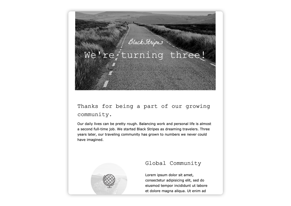
 If your business has a simple, organic voice, choose Piano. This streamlined black and white template can be versatile for any business. It’s a good example of simplicity and the two-color rule. It also provides three alternating content and text blocks, making for a more interesting layout.
3. Automatic
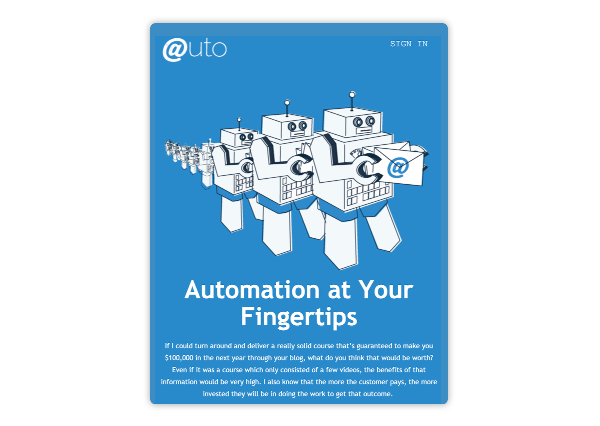
 If your brand thrives on color, Automatic can help you launch your new service. Use our whimsical illustrations provided or let them inspire you to create your own. The template is broken up into alternating color blocks for contrast and provides a membership option which could lead to quick opt-ins for your company.
4. Plane
 If you’re looking to send out a quick promo for your company, Plane is perfect. It captures your attention at the top with the logo, image and color block all in one. Notice how the color scheme flows together and sticks with the brand style. When you open this email, you know exactly who it’s from.
5. International

If you’re looking for a clean template that embraces white space, International will be your breath of fresh air. You can use this template to focus your readers on a webinar and provide them the ability to RSVP immediately.
Email marketing is a primary form of communication when reaching new leads and securing customers, and email templates are a major asset to achieving that goal. With these email templates, you will save time, establish your brand style, and catch the attention of your audience.