Even if the primary purpose of most of your landing pages is to feature marketing copy and generate leads, they’re still ultimately designed to make money. Landing pages are for you to share your knowledge, build your credibility and, in the end, earn leads and sales.
If your business does this well, you’ll have a sustainable advantage over your competition. If you struggle to put together pages that work, you’ll be in trouble.
It’s not hard to make dramatic improvements to your landing pages, though. It really boils down to a few basic ideas: Meet your visitors where they are on their journey; don’t oversell; and make it exceedingly easy for them to make a decision.
Like any other piece of sales or marketing content, your landing pages must make it easy for people to make a decision. If it’s easy and they’re motivated, they’ll be more likely to buy from you.
When creating a landing page, your goal is to give potential customers the right information about your product and make a persuasive argument that it can solve a problem for them or make their lives better.
Connect the Headline
Let’s say you have a basic funnel that includes a text-based paid ad driving traffic to a landing page with a form. When someone reads your ad, they’ve done three things in your favor. They:
- Took the time to read your ad amidst everything else on your page
- Decided they liked the ad
- Decided to click on the ad to see where it goes
If a person clicks into your page and the ad text is different than the headline on your landing page, they may be surprised — an emotion you don’t want your landing pages to evoke.
When someone is compelled to actually read your ad, something caught their attention. So why, when you send people from the ad to the landing page, would your headline include anything other than the text from your ad? It’s confusing and doesn’t capitalize on what worked in the first place.
In the example below, simply matching the headline to the ad text eliminates confusion for the reader.
Ask for Less Information
Has anyone ever asked you to apply for a credit card or register to vote? They need a lot of information, and the excessive form fields can be overwhelming and annoying to fill out.
Do you want people to get the same feeling when they see the form on your landing pages?
Of course not, yet it’s easy to get contact-information greedy as business owners and marketers. It’s tempting to ask for your visitor’s address, work phone, and the name of their first born child, but it’s never a good idea. Statistics show that asking for too much information will cost you conversions.
The hard thing is that there’s no “perfect” number of forms on your landing pages. There’s a tradeoff: Asking for more information reduces your conversion rate but potentially increases the quality of your leads and provides you with more information to guide your sales conversations. Asking for less information increases your conversion rates but also drives down the overall quality of leads.
My solution: Collect as many email subscribers as you can with a simple one-field email opt-in, then provide subscribers offers to become leads or buyers, and ask for more information at that stage.
Don’t Oversell — Have a Process Instead
There’s a strong temptation to build every feature and benefit into your landing pages, to answer every objection and question that a visitor can possibly have, or to throw in those additional testimonials and social proof points. All this extra information is exhausting for the reader; it’s overselling.
Resist the urge.
Instead, think of your landing pages as stepping stones to move people along the path of their own journey from stranger (to you and your business) to customer and evangelist.
When they hit your landing page, supply just enough information for them to decide if they want to move to the next step. Nothing more.
Your landing pages should fit into a process that goes something like this:
As you write your landing pages, ask yourself this question about each element and piece of copy: Is this information compelling and necessary for someone to decide to move to the next step?
If the answer is no — cut it.
By cutting extra information, you focus the message and avoid fatiguing your readers. If you give them too much information, they probably won’t remember anything, and wouldn’t it be much better to have people remember just a few important things?
Click for Benefits
Asking someone to take action is a big step.
They have to decide if your product or service is for them. Then they have to decide if they like your approach, personality and specifics (such as features). And they have to decide if they like it all enough to take action right now.
And you want that outcome to occur over and over again.
If you’re in B2B, the benefit is probably something like saving money, making money or avoiding risk. If you’re in B2C, it might include having fun, being healthy or saving time. No matter what your product is, you must provide some distinct, easy-to-articulate benefit so that there’s a compelling reason to buy.
So why in the world would you ask them to “submit” at the end of the process? You’ve promised exciting benefits along their entire journey, and now your copy has turned bland.
Your headline or subhead makes a promise. If someone is intrigued by that promise and makes it all the way to your call to action, remind them why they came so far. That’s right — say the same exact thing in your call to action that you said in your headline.
Let’s pretend you’re selling the fastest internet router on the market. It hasn’t launched yet, but you’re collecting email addresses from people who want to be notified when it’s available. Here are a few examples of exciting, benefit-driven copy, and a few pedestrian button copy examples for contrast:
The good copy examples work because they reaffirm the reason the person is on the page in the first place. If they’ve gone to the trouble of reading everything on the page, they probably wanted those initial benefits really badly. Give it to them.
Make the Decision Easier
Making the decision to buy something can be challenging for people, but there are many tactics you can use to appeal to consumers’ natural aversion to risk.
The most common is to offer a money-back guarantee, reducing the commitment a person needs to make before trying you out.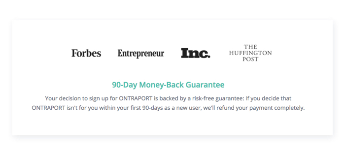
Here are a few variations on the concept:
- 30-day trial, no questions asked
- 200% money-back guarantee
- Satisfaction guaranteed or your money back
- Lose your income and we’ll take your car back (Hyundai)
- You’ll love it or you can slap me in the face (thank you Andrew Warner of Mixergy.com)
Another effective form of risk reversal is the free trial. This works wonders for products that your buyers want to try before they buy, from soap to software. Here’s a free trial example:
The reason risk reversal is so powerful is that you demonstrate confidence in your business. People are very risk averse. By reducing their risk, you’re reducing their stakes. If they have less to lose, you’re making their decision easier.
Show Some Proof
Another way of reversing risk is to show that other people have used your product or service and liked it. That’s where testimonials and other forms of social proof come in.
Before there was the internet or the Better Business Bureau, it was hard to tell if someone — an individual or a business — was lying or misrepresenting their claims.
Naturally we relied on other people to tell or show us that something was low risk. It’s called social proof and it’s simple: If other people like it, it must be good.
There are a few easy ways to show social proof on your landing pages:
- Testimonials
- Companies using your product
- Number of shares
- Numbers of users/dollars/installs
- Case studies
Social proof is as effective as risk-aversion guarantees — it provides valuable word-of-mouth evidence that your product works.
Take a few of the lessons you’ve learned today and implement them right away. I recommend setting up a test to see which techniques work for your product.
The purpose of landing pages is often lead generation, but think further to your ultimate goal — generating revenue. Landing pages must convert and, with these five hacks, you’ll watch your landing pages become top performers.