Ontraport's Trends Dashboard gives you a bird's-eye view of how your sales, marketing, and business data changes over time. You have colorful trend charts showing what's working and what may need more attention in your strategy.
You can see if you're getting more new leads over time or fewer. You can also know how often contacts engage with your marketing emails. You can also check to see if there's a change in the number of people visiting your sales pages over the past month.
Both your Trends Dashboard and your Metrics Dashboard show you essential information for your business in their way. If you want to see data as snapshots in time, check out your Metrics Dashboard.
The Trends Dashboard is available for all account levels.
Table of contents
Navigate to your trends charts
Trends toolbar
Edit your chart layout
Contacts chart
Email chart
SMS chart
Page Visits chart
Sales chart
Monthly Recurring Revenue chart
Payment Plans chart
Tasks chart
Automations chart
Partners chart
Navigate to your trends charts
You can get to your Trends Charts by clicking Dashboard from your main navigation.Then click the Trends tab on the left.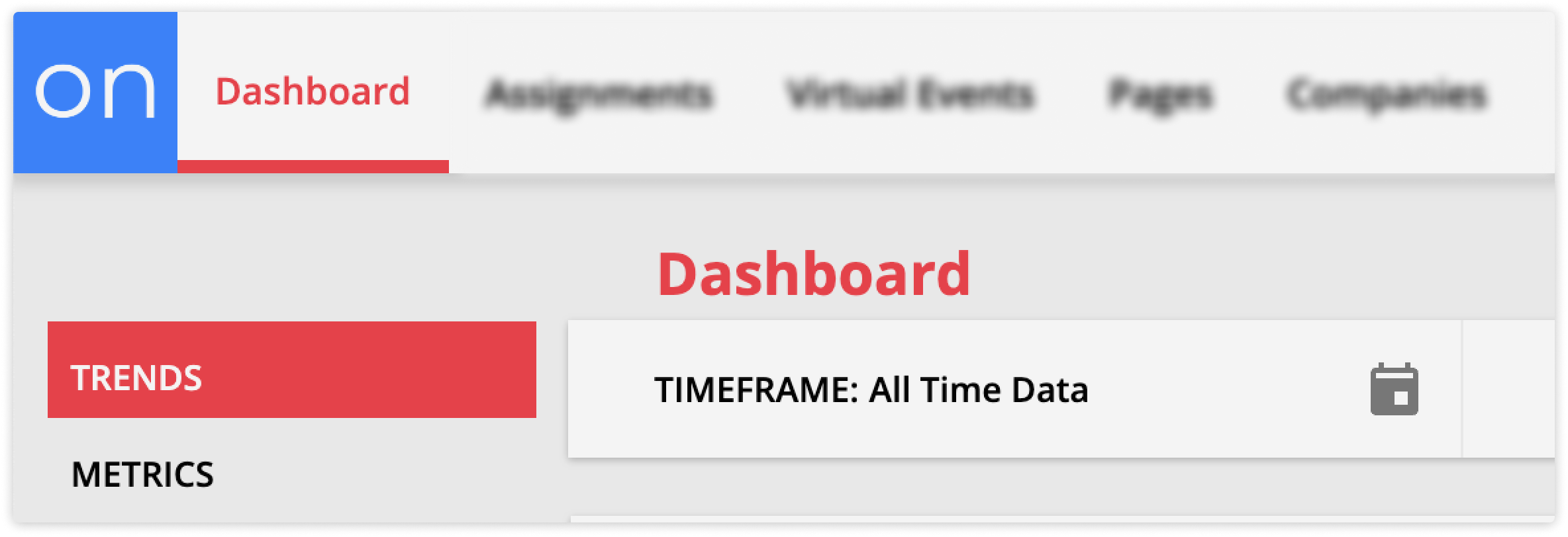
Once you navigate to your trends dashboard, you can view the charts below and filter each chart to see the exact information you want. At the top of the page, you can update the timeframe filter for all charts. Each chart also has filters to hone in on the information you want.
You've also got some other helpful controls from your Toolbar. Let's take a look:
Trends toolbar
The toolbar at the top of your Trends Dashboard allows you to set a time frame for all the charts on your page, customize your page layout and more.
Here’s what each of your toolbar buttons do:
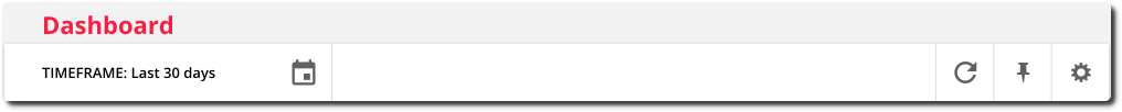
Click 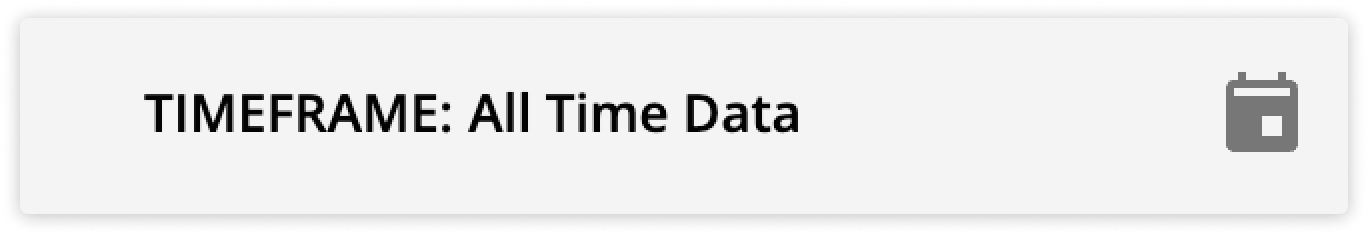 to select the timeframe for all the charts on your page.
- Adjusting your timeframe is a great way to see how different charts may impact each other.
- For example, if you suspect that when you send more emails, you get more sales. Then you can view your email and sales data for the past week, last 30 days, etc., and see if when your emails go up, your sales do too.
Click ![]() to view your charts in fullscreen.
to view your charts in fullscreen.
- This is helpful if you want a wider view of all your charts.
Click  to refresh your dashboard charts.
- Use the refresh button when you want to pull in new information.
Click .png) to add your Trends Dashboard to your pinned items.
to add your Trends Dashboard to your pinned items.
Click ![]() to edit your dashboard layout by selecting which charts you want to see, and reorder them. Check out the “Edit your chart layout” section below to learn more.
to edit your dashboard layout by selecting which charts you want to see, and reorder them. Check out the “Edit your chart layout” section below to learn more.
Edit your chart layout
Back to top
You can edit the layout of the charts on your Trends Dashboard to organize your data and hide charts you don’t want to view. You can change your chart order if you want two charts to be next to each other. And if you’d like to hide a chart you don’t use, you can toggle it off. Here’s how:
- Click
 to open your layout editor.
 - Hover over the chart you want to move or remove.
- To move a chart click, hold and drag the chart to the new position.
- To remove a chart toggle it off.
- Click Save at the bottom of the settings.
Contacts chart
Your Contacts chart allows you to track your identified contacts over time. This chart helps you determine how well your lead collection automation maps are performing and view how active your contacts have been in the selected time frame.
You will also have a chart for every custom object enabled in your account. Your custom object charts will have the name of your object and will function just like your Contacts chart.
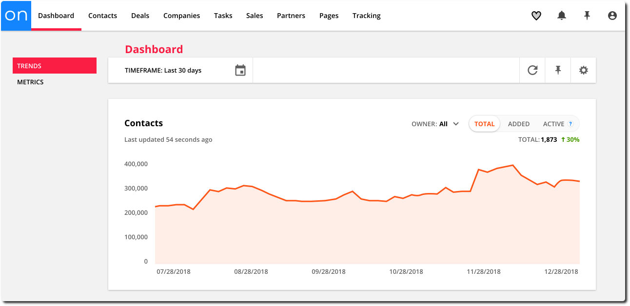
Filter your Contact chart by:
Owner – see data for contacts who are owned by a specific user
Total – the total number of contacts in your account
Added – the number of contacts added to your account
Active – the number of contacts who were active
Email chart
Your Email chart allows you to track how your leads and customers are engaging with the emails you send.
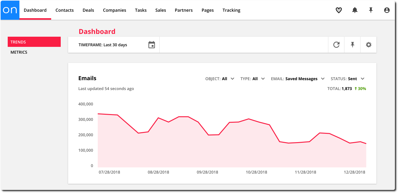
Filter your Email charts by:
Object – see data for emails saved in specific objects in your account, such as Contacts, Deals, Companies and custom objects
Type – see data about emails based on how they were sent.
You can choose from:
- Automated - emails that were sent through automation such as, automations, invoices, membership registration emails, etc.
- Broadcast - emails sent manually
- All - all emails sent both manually and through automation
Email – see data about a specific email
Status – see data about emails that have a specific status
You can choose from:
- Sent - the number of emails sent
- Opened - the number of emails that have been opened
- Clicked - the number of email links clicked
- Unsub - the number of unsubscribes
- Bounced - the number of bounces
- Complained - the number of complaints you’ve received
SMS chart
Your SMS chart allows you to track your SMS engagement with your customers over time. This gives you a better idea of how well your SMS marketing automations are performing. You can see how often you’re interacting with your leads and customers and how engaged they are. Plus you can identify any issues that are leading to unsubscribes and bounces.
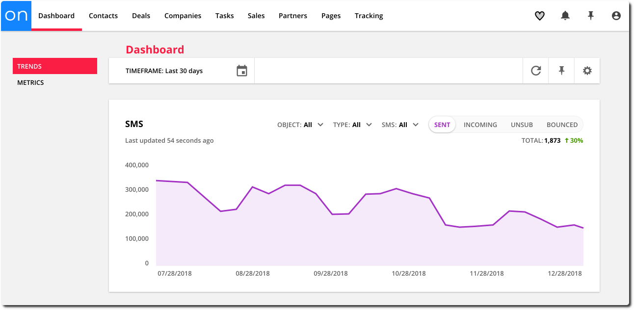
Filter your SMS chart by:
Object – see data for SMS messages saved in aspecific object in your account, such as Contacts, Deals, Companies and custom objects.
Type – see data about SMS messages based on how they were sent.
You can choose from:
- Automated – SMS messages that were sent through automation
- Broadcast – SMS messages sent manually
- All – all SMS messages sent both manually and through automation
SMS – see data about a specific SMS message
Sent – the number of SMS messages you’ve sent over time
Incoming – the number of SMS messages you’ve received over time
Unsub – the number of SMS unsubscribes
Bounced – the number of SMS bounces
Page Visits chart
Your Page Visits chart allows you to track your page visits over time so you can see how well your pages are performing. You can track who’s visiting your site for the first time and your total page views over time.
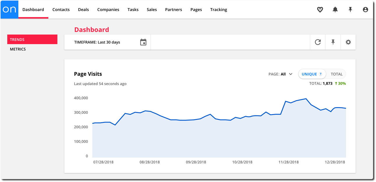
Filter your Page Visits chart by:
Page – see data about a specific page.
Unique – the number of unique page visits
Total – the total number of page visits
Note: The Trends Dashboard only displays page visit stats for identified contacts.
Sales chart
*Available for Plus level accounts and above
Your Sales chart shows you how many sales and refunds you’ve made in a specific time frame. You can track how profitable your business is and identify if you need to implement post-purchase follow-up to reduce the number or refund requests you’re receiving.
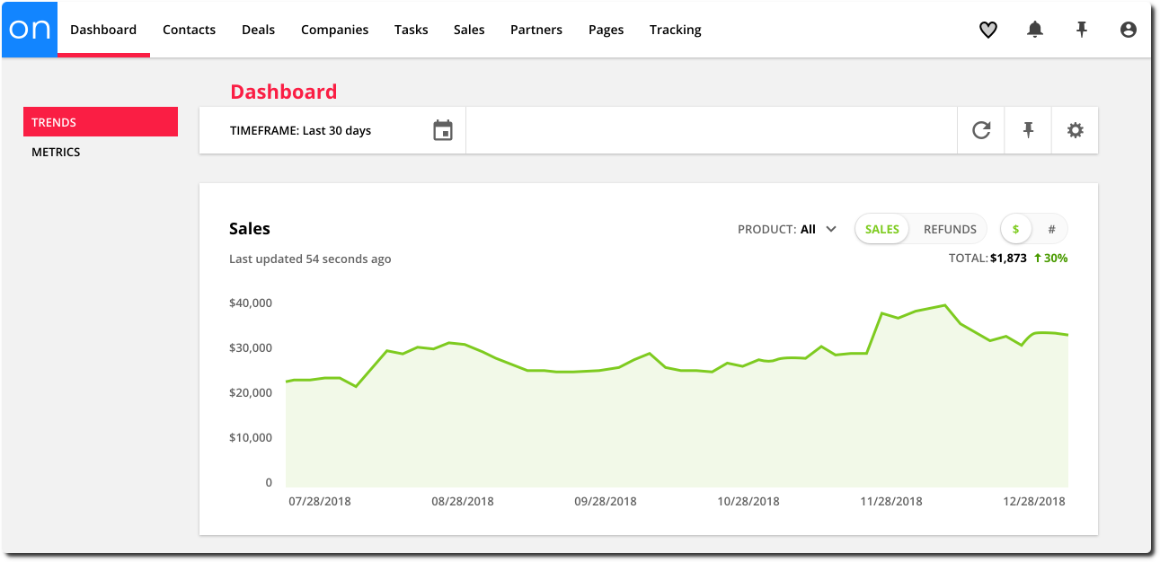
Filter your Sales chart by:
Product – see data about a specific product
Sales – the number — or total dollar amount — of sales made
Refunds – the number — or total dollar amount — of refunds created
$ – view your chart in dollar amounts
# – view your chart in number of sales or refunds
Monthly Recurring Revenue chart
*Available for Plus level accounts and above
Your Monthly Recurring Revenue chart shows you stats about your customers’ subscriptions. You can get a sense of what your business is making over time and make predictions about your upcoming revenue. You can also see if you need to adjust your recharge settings because of a large number of subscriptions in collections or see which subscription products are the most successful.
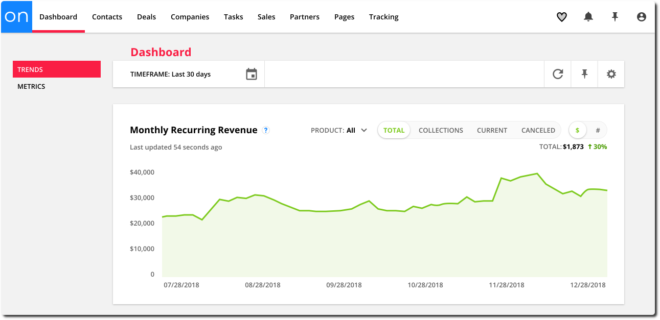
Filter your Monthly Recurring Revenue chart by:
Product – see data about a specific product
Total – the number — or total dollar amount — of subscriptions created in your account
Collections – the number — or total dollar amount — of subscriptions in collections
Current – the number — or total dollar amount — of subscriptions that are current
Canceled – the number — or total dollar amount — of canceled subscriptions
$ – view your stats in a dollar amount
# – view your stats by number of sales
Payment Plans chart
*Available for Plus level accounts and above
Your Payment Plans chart shows you stats about your customers’ payment plans. You can get a sense of what your business is making over time and make predictions about your upcoming revenue.
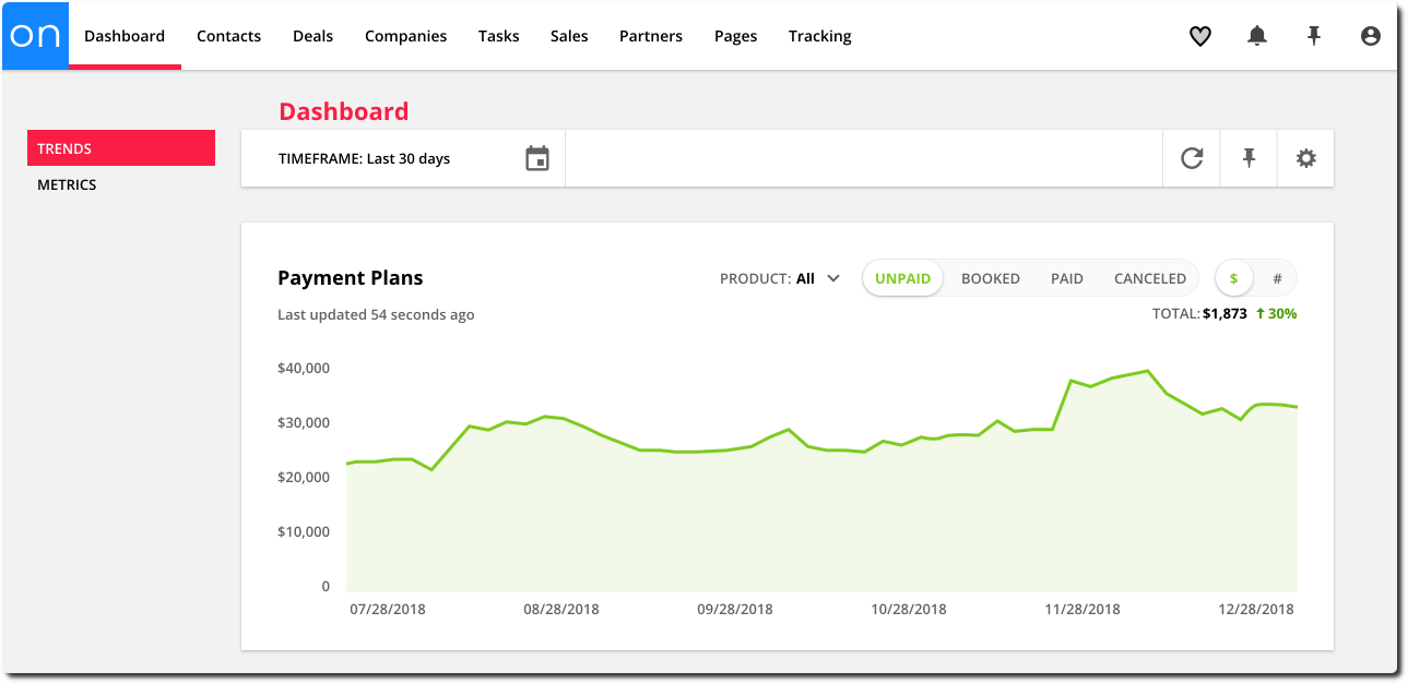
Filter your Payment Plans chart by:
Product – see data about a specific product
Unpaid – the number — or total dollar amount — of unpaid payment plans
Booked – the number — or total dollar amount — of payment plans that were created
Paid – the number — or total dollar amount — of paid payment plans
Canceled – the number — or total dollar amount — of canceled payment plans
$ – view your stats in a dollar amount
# – view your stats by number of sales
Tasks chart
*Available for Plus level accounts and above
Your Tasks chart shows you stats about tasks created for your leads and customers. You can use this chart to get a good idea of your team’s workload and performance.
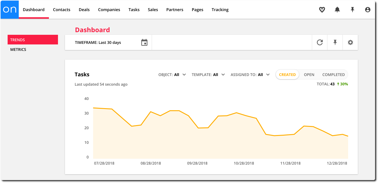
Filter your Tasks chart by:
Object – see data for Tasks for specific objects in your account, such as Contacts, Deals, Companies and custom objects
Template – see data for a specific task template
Assigned to – see data for tasks assigned to a specific user in your account
Created – the number of tasks created
Open – the number of open tasks
Completed – the number of completed tasks
Automations chart
Your Automations chart shows you stats about the contacts on your automation maps. You can see how your contacts are engaging with your automation maps and if your automations are performing as expected.
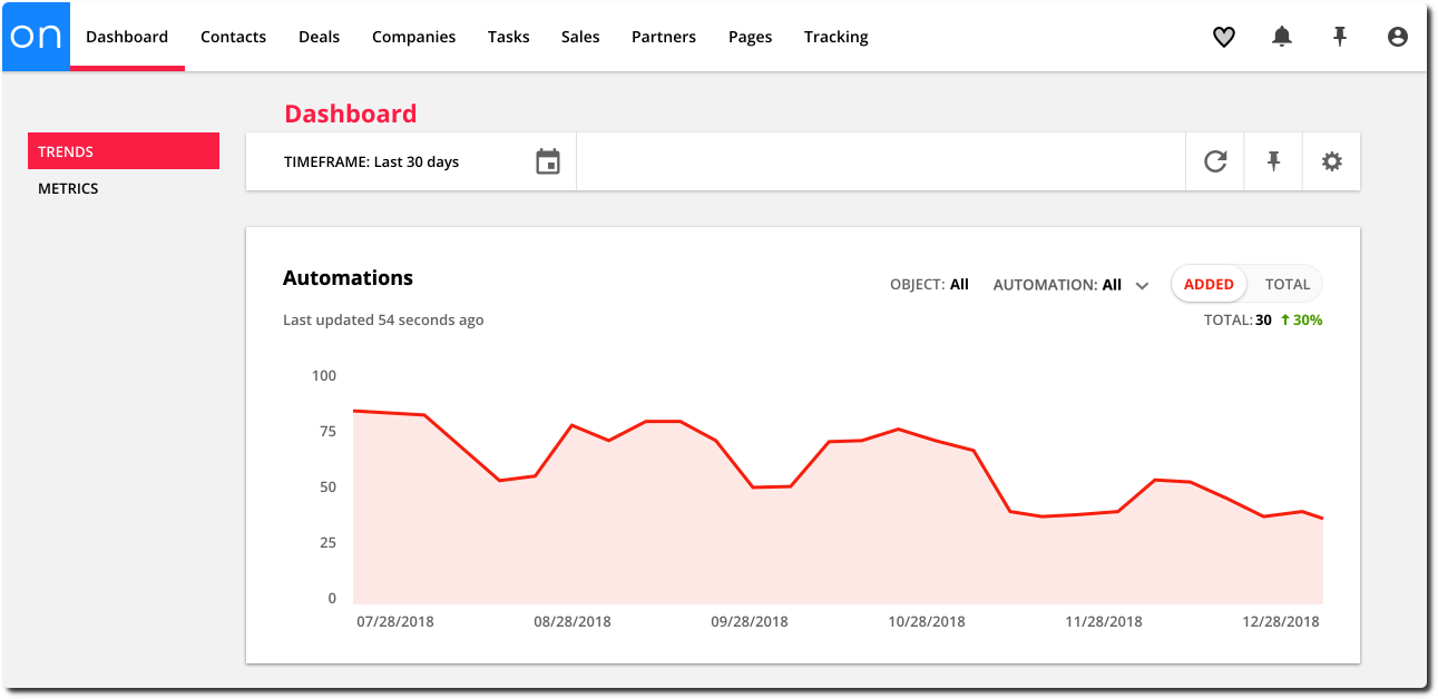
Filter your Automations chart by:
Object – see data for automation maps built in specific objects in your account, such as Contacts, Deals, Companies and custom objects
Automation – see data for a specific automation map
Added – the number of contacts added to your map(s)
Total – the total number of contacts on your map(s)
Partners chart
Back to top
Your Partners chart shows you stats about your partner programs so you can better see how your partners are promoting your business. You can see how much you’ve paid your partners and track referrals.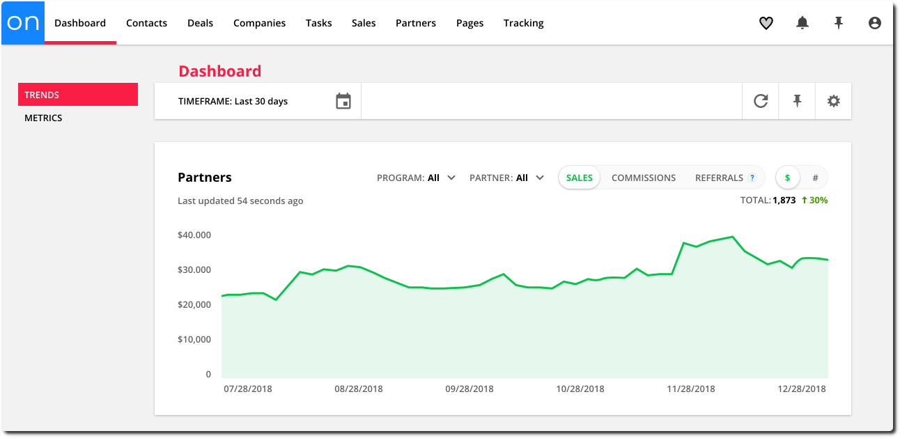
Filter your Partners chart by:
Program - see data about specific partner programs
Partner - see data about a specific partner
Sales - the number — or total dollar amount — of sales made by your partners
Commissions - the number — or total dollar amount — of commissions accrued by your partners
Referrals - the number of — or total amount spent by — contacts referred to you
$ - view your stats in a dollar amount
# - view your stats by number of sales