Ontraport's Page and Mail editors both use a block-based editor. In this editor, you create a layout for your assets by stacking blocks on each other. Blocks are made up of rows and columns, and within those are elements like images, text buttons, and forms.
You can access different settings depending on the editor you're using. This article shows how to add and edit your blocks for either editor and links to a page or email-specific settings.
Table of contents
Create a layout
• Add a block
Edit blocks
• Layout editor settings
• Block top bar
• Block sidebar
• Display settings
• Advanced settings
Edit columns
• Add columns and rows
• Column sidebar settings
Edit mobile styles
Create a layout
Back to top
One of the best ways to ensure your pages look good is to create a layout grid for your page elements before adding them.
It’s an Ontraport best practice to create the block layout using columns and rows rather than relying on your elements’ position settings.
It’s possible to arrange page elements without creating a grid design, but that’s not ideal. Your page content will move around based on screen size. Creating a grid layout holds your elements in relative positions so visitors viewing your page on different devices will see a consistent layout.
Add a block
Back to top
The first step of building your pages is to add blocks.
- If you start your page from scratch, you’ll click Add block to add your first block to the page.
- If you’re adding a block to a page with blocks on it, hover over
/ontraport+pages+-+builder+-+add+new+block+plus+icon+(grey).png) and click Add block where you want to add your block.
and click Add block where you want to add your block.
- If you’re adding a block to a page with blocks on it, hover over
/pages-add_new_block.gif)
Once you’ve done that, you can choose the type of block you want to add. Choose from:
- Build your own block — Choose one of the block layouts to add to your page. You can customize the columns and rows in that block.
- Favorites — Choose from blocks that you’ve previously saved as a favorite.
- Global blocks — Add a global block you’ve saved previously.
- Copy from an existing page — Add a block from another asset. From the dropdown, you can choose the page or email that contains the block you want to copy. Then, select the specific block you’d like to add.
- Pre-designed blocks — Choose from a library of pre-designed blocks. You can filter by type to find the right block for you.
Edit blocks
Back to top
Once a block has been added to your page, hover over it and click /ontraport_pages-element_setting_wheel.png) on the right side to open its settings.
on the right side to open its settings.
There are three areas to access different settings:
- Layout editor settings
- Block top bar
- Block sidebar
/pages-blocks-settings_locations_context.png)
Layout editor settings
Back to top
The controls you’ll see when you first open a block allow you to manage basic settings./pages-blocks-block_basic_settings.png)
You can name, move, copy and delete blocks with these controls.
Name your block — Click /ontraport+pages+-menu+tools+-+font+style+dropdown+-+pencil+icon.png) at the top left of the block to name it.
at the top left of the block to name it.
- We recommend that you always name your blocks, particularly blocks that contain forms on your pages. Your block’s name will help you select the correct form when you select it from your campaign triggers or goals.
Close the settings — To save and close the block’s settings click .png) .
.
Move the block — To move a block click the up or down arrow — /pages-blocks-move_blocks_buttons.png) — to change the order your block appears on your page.
— to change the order your block appears on your page.
- Each time you click the up or down button, your block will go up or down one block.
Copy the block — To copy a block click  to copy your block. The copy block will appear below the original.
Delete the block — To delete a block click /ontraport_pages_builder_delete_block_(trash_icon).png) → Okay.
→ Okay.
Block top bar
Back to top
When you edit any block, you’ll see your block toolbar at the top of your screen./pages-blocks-top_toolbar(original).png)
Your block’s toolbar is where you can:
Convert your block to be dynamic (Pages only) — Click  to make your block dynamic.
Make your block global — Click /ontraport_pages_builder_edit_block_make_global_block_(button).png) to make your block global.
to make your block global.
View your block’s grid, padding and margins — Click /ontraport+pages+-menu+tools+-+layout+icon.png) to view the padding and margins on your block.
to view the padding and margins on your block.
- Padding appears as a blue highlight, and your margins are in red.
Add your block to your favorites — Click /ontraport+pages+-menu+tools+-+font+style+dropdown+-+heart(favorite)+icon.png) to add your block to your favorites.
to add your block to your favorites.
Block sidebar
Back to top
Your block sidebar is where most of your block’s settings live. From there, you can customize your block’s styling, make your block sticky, and access your display settings. You can also access your form settings if your block has a form./pages-blocks-sidebar_settings.png)
Here are the settings you can access from this section:
Background
Block background settings let you add four types of backgrounds to your blocks:
- Colors
- Choose “transparent” from the colors option.
- Image
- Video (Pages only)
Once you select a background type, you’ll have different customization options. For example, a transparent background has no settings, and YouTube video settings allow you to darken your video and start at a specific time.
Spacing
Block spacing settings let you control your block’s padding, margins, sizing and alignment.
Border, arrow and shadow (Border and shadow in the Mail editor)
These settings allow you to add a border or drop shadow to your block, making it stand out by creating contrast against the background.
In the pages editor, you can add an arrow to the bottom of your block and a drop shadow to your block and your block’s content.
This setting lets you add a border to a block. When you select a border style, other options will allow you to customize it.
You can change the border-radius to round the corners of your block’s border, select a border style, and select your preferred border color./pages-blocks-unlock_border_style.gif)
Arrow borders allow you to add an arrow to the bottom of your block. Learn more here.
Drop shadows allow you to add depth to your blocks. This visual cue indicates to your visitor that the block can move over blocks (check out the sticky block setting below) or is clickable. You can add a drop shadow to your whole block, to the content in your block, or both!
Sticky block (Pages only)
Sticky blocks will “stick” to the top of your page once your visitors scroll past it.
Check out this article for more information.
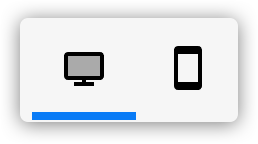
Display settings
Back to top
Your block’s display settings are a powerful personalization tool. They allow you to choose when your block should appear.
Both pages and Ontraport Mail messages allow you to customize your device display settings. Pages also allow you to customize when you want a block to be displayed and who should see your block. Learn more here.
Advanced settings
Back to top
Every block has an advanced settings section that allows you to add custom classes to the block’s wrapper element to target the block or its children with CSS or Javascript.
Here’s how to use custom CSS classes:
- Open your block’s settings and click Advanced settings.
- Add a custom CSS class to the “Custom block classes (advanced)” field.
- Click Done again to save your block settings.
- Go to Settings → Custom Code → Header.
- Add the CSS you want to apply to your element.
- Click Done to save your settings.
Learn more about custom classes and explore use cases here.
Edit columns
Back to top
Blocks are made up of columns and rows. You can add multiple columns to each row, and every row is made up of at least one column. Every column on your page also has its sidebar settings. You can customize your column’s background, spacing, and border style from there.
Add columns and rows
Back to top
You can add 12 columns to any block and an unlimited number of rows. Here’s how:
- Hover over your block’s and click Edit block.
- Hover over your block and notice there are plus signs on each side of your block. Click on the side of the block you want to add on to.
- If you click on the right or the left, you’ll add a column.
- If you click on the top or the bottom, you’ll add a row.
/pages-blocks-add_columns_rows.gif)
Column sidebar settings
Back to top
Your column sidebar settings work like your block settings. But since columns are nested inside of blocks, you have fewer options. Check out the block sidebar section to learn about each of these settings.
Edit mobile styles
Back to top
Use mobile font settings to ensure your emails look how you want them to, whether viewed on mobile or desktop. With these settings, you can adjust the font style, size, and mobile block spacing for backgrounds for mobile displays. All other settings, such as font colors, backgrounds, images, etc., will remain the same between mobile and desktop displays.
Some buttons on the editor's right side allow you to switch between desktop and mobile view.
When you click .png) you’ll switch to the mobile device display. Your email’s canvas will scale to 360 px wide, the average width of mobile devices.
you’ll switch to the mobile device display. Your email’s canvas will scale to 360 px wide, the average width of mobile devices.
- Edit the page or email you want to format for mobile devices.
- Click to change the view of your message to mobile display.
- The canvas will shrink to the average size of a mobile device — 360px wide.
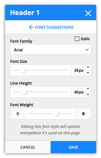
- Click Mobile Font Style, and click
.png) next to the font style that you want to edit.
next to the font style that you want to edit.- From inside the font settings, you can edit the following:
- Font Family
- Font Size
- Line Height
- Font Weight
- From inside the font settings, you can edit the following:
- Click Save.
Edit mobile block spacing
- Click to switch to your mobile display.
- Click a block to edit it.
- Click and adjust the top and bottom spacing of your block.
- Your blocks don’t have left and right spacing. That’s because they are set to “full width,” which means they’ll be easy for your recipients to read.
- Click Save.
Note that background images are not mobile responsive. They will not resize relative to the display they are viewed on. You can adjust how the background is displayed by adjusting the mobile block spacing.