Most web traffic today comes from mobile devices, so your page has to look good on a little screen.
There are a few strategies that are considered best practices for mobile design. When you use columns and rows to create your page’s layout, you create a responsive web design that automatically fits different-sized screens. But pages sometimes look imperfect once they fold up and shrink down. You can customize mobile-specific settings and even create mobile-only blocks in those cases.
In this article, you’ll learn how to ensure your pages look great on any device.
Table of contents
How Ontraport makes pages mobile responsive
Mobile style settings
• Mobile font styles
• Mobile block spacing
• Mobile column spacing
• Mobile element position settings
Mobile-only blocks
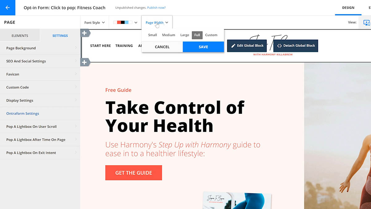
Mobile width
Dynamic blocks and mobile view
Using rows for vertical alignment
How Ontraport makes pages mobile responsive
Ontraport’s drag-and-drop page builder automatically creates mobile responsive pages so your pages look great on any device.
And it’s all down to the layout of Ontraport Pages.
An Ontraport page contains a list of blocks consisting of columns and rows. Ontraport uses that layout to transform your design into a mobile-responsive version of your page.
When you click /ontraport_pages_builder_mobile_view(button).png) to switch to mobile view, you’ll notice that the columns on your desktop view shift.
to switch to mobile view, you’ll notice that the columns on your desktop view shift.
When your desktop view has columns next to each other, the side-by-side columns will reorient themselves vertically. The columns on the left side will be at the top.
Here’s an example of a block in desktop view:
/pages-mobile_columns-1.png)
And here’s what the same block looks like in mobile view:
/pages-mobile_columns-2.png)
While your columns and rows create a mobile responsive layout, you can still optimize your page’s mobile version. If you want to change how your blocks look on mobile, you have two choices:
- Edit your mobile style settings
- This option is best when you want to keep the same design and optimize the margin and padding of your elements or mobile fonts.
- Create a mobile-only block
- This option is best if you want to change your design. You might create a mobile-only block if you want to remove text and add an image to your mobile block.
Mobile style settings
You can customize your mobile font style, block spacing, column spacing, and element positions. This lets you tweak the layout created with columns and rows to perfect your mobile design.
Mobile font styles
Hover over the device preview icon, /ontraport_pages_builder_desktop_and_mobile_view(button).png) then click to go to your mobile view.
then click to go to your mobile view.
Click on the mobile font style dropdown to edit the style of your fonts when your page is viewed on mobile.
/pages-mobile_fontstyle_dropdown.png)
You can customize:
- Font family
- Font size
- Line height
- Font weight
This makes it possible to have completely different fonts on mobile or simply optimize the size, height and weight of your fonts for mobile.
Some things to consider:
- Font legibility. Choose fonts that are easy to read on smaller screens. Overly ornate or stylized fonts may become illegible in smaller sizes.
- Font size. Generally, your text will read better on smaller devices using smaller font sizes. On desktop standard font sizes for paragraphs range from 16 to 18px, while on mobile that’s 14-16px.
- Font family. Some fonts are more suitable for mobile pages because they are easier to read across various screen sizes. Web designers often prefer sans-serif fonts because of their clean and straightforward appearance. Serif fonts still have their place, mainly for headings or larger text. Google fonts are also a great option because they are “web-safe,” meaning the font displays consistently across all devices. Here are some specific font suggestions:
- Roboto
- Nunito
- Montserrat
- Lato
Click here to learn more about editing your font styles.
Mobile block spacing
When you set your device preview to desktop and mobile blocks (), you can customize the spacing of the mobile version of your blocks.
- Hover over
/ontraport_pages-element_setting_wheel.png) and click Edit block → Spacing.
and click Edit block → Spacing. - At the top of the left sidebar, click Mobile.
- Customize your mobile spacing.
/pages-blocks-block_spacing_mobile_settings.png)
Mobile column spacing
Just like mobile block spacing, you can customize the spacing for your columns in mobile view.
- Hover over and click Edit block.
- Then hover over the column you want to edit and click → Spacing.
- At the top of the left sidebar, click Mobile.
- Customize your mobile spacing.
Mobile element position settings
Mobile element position settings let you customize page elements’ position when viewed on a mobile device. These let you customize your element’s padding, margins, alignment, and element width, all of which work together to set the position and size of each element in your mobile view.
- Click the to get to the mobile view.
- Hover over an element and click .
- Then click on the position tab in the left menu.
- Customize the mobile position of your element.
/pages-mobile_position_settings.png)
Mobile-only blocks
Some desktop block designs are too busy or challenging to use on mobile devices, and fixing spacing, and sizes won’t get you where you want to go.
You solve that problem by creating a separate block only shown on mobile devices.
- From the add devices view, hover over on the offending block and click Edit block.
- Click Display settings.
- Choose “Desktop Only” from the “Device display” dropdown.
- Copy your block.
- Hover over on your new block and click Edit block.
- Click Display settings.
- Choose “Mobile Only” from the “Device display” dropdown.
- Optimize your mobile-only block for mobile devices using the settings above.
/pages-blocks-display_settings_2.png)
Mobile width
The mobile width setting lets you choose the screen size that will trigger your page to display using the mobile styling. This is also often called the “mobile breakpoint.”
The default setting of 600 px fits most users’ needs. You might consider changing this setting if:
- You want to include tablets in your mobile view.
- Update the mobile width to around 800 px.
- You want only to include cell phones in your mobile view.
- Update the mobile width to around 600 px.
Dynamic blocks and mobile view
There are two types of layouts that you can use for dynamic blocks:
- List
- Grid
When your dynamic block uses the list layout, your columns and rows collapse like a regular block. Side-by-side columns will reorient vertically, with the left-side columns on top.
/pages-mobile-dynamic_block_example_3.png)
/pages-mobile-dynamic_block_example_4.png)
When you use the grid mode on your dynamic block, any side-by-side columns in your card will reorient themselves vertically.
/pages-mobile-dynamic_block_example_1.png)
/pages-mobile-dynamic_block_example_2.png)
Using rows for vertical alignment
If you create a grid to display information, you might add rows to display the label for each section. This layout is fantastic for desktop blocks.
Here’s an example of a block that uses rows to separate the label, content, and button elements from each other:
/pages-mobile_aligment_example_1.png)
However, it is not ideal for mobile blocks because the way that rows and columns collapse in mobile view will cause all your labels to appear above each other instead of above the section the label belongs to.
Here’s an example of the mobile version of the block above:
/pages-mobile_aligment_example_3.png)
Notice that the page’s mobile version doesn’t display the content in the correct order. The labels appear at the top, then both sets of content and both buttons are at the bottom of the block.
If you want to use rows to add labels to the desktop version of your page, you can create a separate mobile-only block.
Here’s an example of the same block using a mobile-friendly layout:
/pages-mobile_aligment_example_4.png)
On the mobile-only block, place the label and the content into the same row, and use element position settings to customize your spacing.
Here’s an example of the mobile version of the block above. Notice that the mobile-friendly layout ensures that your content appears in the correct order:
/pages-mobile_aligment_example_2.png)